How do Alignment Rects Work?
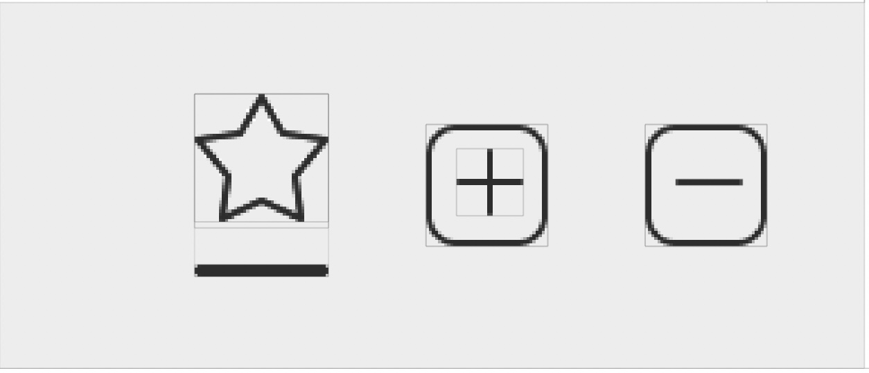
01 Jul 2018Recently I had to build a layout with a horizontal array of NSButtons that are all vertically centered. The tricky part was that one of the buttons needed an indicator view to represent its control state (present for .on, hidden for .off.) Using typical constraints produced a layout like this:

As you can see, the star button’s frame is centered with the frames of the plus and minus buttons, which isn’t what we want. I remembered having seen references to alignment rects in a WWDC session, and after tracking it down on ASCIIwwdc, I learned that you could use your view’s alignment rect to describe the region that contains its content. That region might be different from your view’s frame if you have ornamentation like a drop shadow or, in my case, an indicator view. After double checking the docs I realized that I either needed to:
- override
alignmentRect(forFrame:)andframe(forAlignmentRect:)(which should be inverses of each other) or - override
alignmentRectInsets
This led to a number of hours frustratedly banging my head against my desk. Here’s what I was doing:
class StarButton: NSControl {
    ...

    enum Metric {
        static let imageHeight: CGFloat = 22
        static let imageWidth = imageHeight
        static let frameHeight: CGFloat = 30
    }

    private func configureViews() {
        for subview in [imageView, indicatorView] {
            subview.translatesAutoresizingMaskIntoConstraints = false
            subview.leftAnchor.constraint(equalTo: leftAnchor).isActive = true
            subview.rightAnchor.constraint(equalTo: rightAnchor).isActive = true
            addSubview(subview)
        }
        imageView.topAnchor.constraint(equalTo: topAnchor).isActive = true
        imageView.heightAnchor.constraint(equalToConstant: Metric.imageHeight).isActive = true
        indicatorView.bottomAnchor.constraint(equalTo: bottomAnchor).isActive = true
    }

    override var intrinsicContentSize: NSSize {
        return NSSize(width: Metric.imageWidth, height: Metric.frameHeight)
    }
}
- The star button has two child views - an image view for the star, and the indicator view below
- Constraints for the image view pinned it to the top, left, and right of its superview, as well as constraining its height.
- Constraints for the indicator view pin it to the bottom, left, and right of the superview
- Override
intrinsicContentSizefor the button and return its full size of 22 x 30 points
From here I tried both of the approaches above – first overriding alignmentRectInsets and returning NSEdgeInsets(top: 0, left: 0, bottom: 8, right: 0) (since 8 points is the difference between the view’s frame height – 30 points – and the height of the image view – 22 points.) This didn’t do what I wanted at all. Neither did overriding the alignmentRect(forFrame:) and frame(forAlignmentRect:). I also experimented with getting rid of the intrinsicContentSize override and using explicit width and height constraints (22 x 30) but results were the same.
It wasn’t until I stumbled across an article on objc.io that I spotted the missing piece of the puzzle, namely that the “intrinsic content size of a view refers to its alignment rect, not to its frame.”
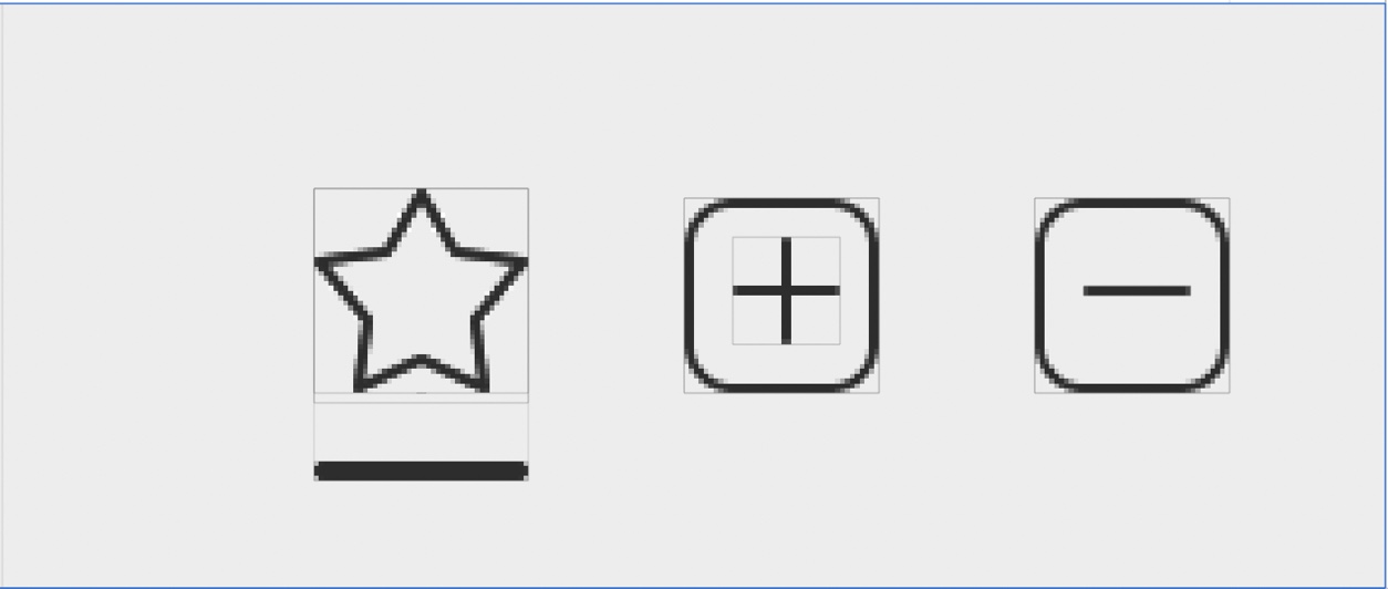
In order to get the layout I wanted I needed to:
class StarButton: NSControl {
    ...

    private func configure() {
        for subview in [imageView, indicatorView] {
            subview.translatesAutoresizingMaskIntoConstraints = false
            subview.leftAnchor.constraint(equalTo: leftAnchor).isActive = true
            subview.rightAnchor.constraint(equalTo: rightAnchor).isActive = true
            addSubview(subview)
        }
        imageView.topAnchor.constraint(equalTo: topAnchor).isActive = true
        imageView.bottomAnchor.constraint(equalTo: bottomAnchor).isActive = true    // self.bottomAnchor now describes the bottom of the *alignment rect*
        indicatorView.bottomAnchor.constraint(equalTo: bottomAnchor, constant: -(Metric.frameHeight - Metric.imageHeight) // indicatorView now constrained to be outside the alignment rect
    }

    override var intrinsicContentSize: NSSize {
        return NSSize(width: Metric.imageWidth, height: Metric.imageHeight) // size of the alignment rect, not the view's frame
    }

    override var alignmentRectInsets: NSEdgeInsets {
        var insets = NSEdgeInsetsZero
        insets.bottom = Metric.frameHeight - Metric.imageHeight
        return insets
    }
}
- Constrain the top, left, right, and bottom of the image view to its superview. Since we’re supplying an alignment rect that’s different from the view’s frame, we’re really constraining the bottom of the image view to the bottom of the alignment rect.
- Constrain the bottom of the indicator view to the bottom of the image view, offset by 8 points. Since the image view is constrained to superview’s bottom, this is effectively constraining the indicator view to be “outside of the superview” (i.e., outside its alignment rect.)
- In
intrinsicContentSizereturn the desired alignment rect size of 22 x 22 points - Return
bottom: 8as before inalignmentRectInsets

Simple. So here’s what I learned:
- When you’re setting up layout constraints for a view whose alignment rect you want to manipulate, you should think of constraining to your superview’s edges as constraining to the edges of the alignment rect instead
intrinsicContentSizeor explicit width and height constraints should describe the width and height of the alignment rect, not the width and height of your view’s frame- Overriding
alignmentRectInsetsis easier than messing withalignmentRect(forFrame:)andframe(forAlignmentRect:)